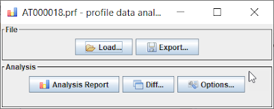
In this blog, we would like to introduce the “profile data analyzer”, a new standalone tool to analyze performance trace, including the idea behind it and the analysis steps. The profile data analyzer supports both ABAP performance trace and SAP JVM Profiler performance trace (*.prf format) as documented in KBA 2879724, but we will focus on the analysis of ABAP performance trace in this blog.
It provides additional graphic and interactive views comparing to SAT/SE30/ST12 to make the performance analysis easy, for example, in the following scenarios.
◉ Get an overall picture of the traced program, including the program logic and how the time is spent.
◉ Find out the bottleneck in large and complex traces, especially when the time is averagely spent on different methods.
◉ Compare two traces in the graph view. Sometimes it is helpful to compare two traces, for example, to understand why there is a performance downgrade after a support package upgrade.
In the following parts of this blog, we will demonstrate how to use the profile data analyzer to understand both the performance bottleneck and the program logic for optimization.
This blog will use two SM21 traces as examples to show the usage of the profile data analyzer. The main difference between these two SM21 traces is the data volume. We will show how to use the profile data analyzer to understand SM21’s logic and the performance of these two traces, including their difference.
◉ The short SM21 trace. Change the selection criteria in SM21(e.g. time) to make sure that no log entry is shown on the screen.
◉ The long SM21 trace. Change the selection criteria in SM21(e.g. time) to make sure that many log entries are shown on the screen.
It provides additional graphic and interactive views comparing to SAT/SE30/ST12 to make the performance analysis easy, for example, in the following scenarios.
◉ Get an overall picture of the traced program, including the program logic and how the time is spent.
◉ Find out the bottleneck in large and complex traces, especially when the time is averagely spent on different methods.
◉ Compare two traces in the graph view. Sometimes it is helpful to compare two traces, for example, to understand why there is a performance downgrade after a support package upgrade.
In the following parts of this blog, we will demonstrate how to use the profile data analyzer to understand both the performance bottleneck and the program logic for optimization.
Getting Started
This blog will use two SM21 traces as examples to show the usage of the profile data analyzer. The main difference between these two SM21 traces is the data volume. We will show how to use the profile data analyzer to understand SM21’s logic and the performance of these two traces, including their difference.
◉ The short SM21 trace. Change the selection criteria in SM21(e.g. time) to make sure that no log entry is shown on the screen.
◉ The long SM21 trace. Change the selection criteria in SM21(e.g. time) to make sure that many log entries are shown on the screen.
Now we could drag and drop the collected ABAP trace into the profile data analyzer and click the “Analysis Report” button to show the report and flame graph.
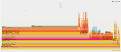
Flame Graph for Performance trace
Here is the flame graph with the default setting for the short SM21 trace (Tip: Please zoom this page in your browser to view the details of the flame graph). In the flame graph
◉ Every column is a call stack. The main program is at the bottom (e.g. Transaction SM21 on the following picture). The lower method calls the upper method.
◉ The width in the graph is proportional to the actual time used by that call stack.
◉ We could zoom in or zoom out in the graphic view by clicking a method on the call stack.
◉ Special method types have dedicated colors. For example, DB methods are blue.
◉ We could search a keyword with the “Search” button with regular expressions. The search results will be highlighted in purple.
◉ The call count of a call stack is shown like “Calls: XXX” on top of the call stack.
Understanding the short SM21 performance trace
Looking at the above flame graph for the short SM21 trace, the following methods are highlighted in purple by searching with “MAIN|RSLG_DISPLAY|GET_INSTANCE_BY_FILTER”
◉ PERFORM MAIN
◉ CALL FUNCTION RSLG_DISPLAY
◉ CL_SYSLOG.GET_INSTANCE_BY_FILTER
In the above graph, we could find that
◉ The form MAIN is the main part of Program RSYSLOG / TRANSACTION SM21.
◉ In form MAIN, the important calls are function module “RSLG_DISPLAY” and class method “CL_SYSLOG.GET_INSTANCE_BY_FILTER”.
◉ Because “RSLG_DISPLAY” has a long execution time than “GET_INSTANCE_BY_FILTER”, it is wider and longer in the flame graph.
◉ Move the mouse to a method, the tooltip will show the detailed time information.
We can click “CL_SYSLOG.GET_INSTANCE_BY_FILTER” to focus on the details of “GET_INSTANCE_BY_FILTER” and hide other parts. Here is the focused view for “GET_INSTANCE_BY_FILTER”. In this focused view, we could find that
◉ “GET_INSTANCE_BY_FILTER” calls other methods and function modules, e.g. “READ_ENTRIES” and “RSLG_READ_SLG” which is used to read the system log entries.
Another interesting part in this example is that, there are some “Not shown methods” on top of “RSLG_DISPLAY” and “CALL_SCREEN”. They are some SYSTEM programs that are filtered. The filter rule is the same as the default SAT setting. We could show these filtered methods by checking the “Show technical details” option.
Check the “Show technical details” option and click the “Analysis Report” button again, we will get the following un-filtered graph. In this graph, we could find that
◉ “RSLG_DISPLAY” will call some screen function modules and finally use RFC “OLE_FLUSH_CALL” to communicate with SAPGUI.
◉ Usually the percentage of “Not shown methods” is low, because most of the cases, the application programs use more time. We recommend using the default profile data analyzer options as the very beginning, and only check the “Show technical details” option when the time of “Not shown methods” is long.
Understanding the long SM21 performance trace by diff
Now let’s understand the long SM21 trace. Here is the flame graph of the long SM21 trace. In this graph, we could find out that
◉ “GET_INSTANCE_BY_FILTER” is longer than the short SM21 trace because we select more data in the long SM21 trace.
Look at the above graph, it is also not so clear about the exact difference with the short SM21 trace. To improve it, we developed the diff function. We could compare the two SM21 traces with the following steps.
◉ Drag and drop the short SM21 trace into the profile data analyzer. The first trace will be used as the benchmark.
◉ Click the “Diff …” button and then select the long SM21 trace. The second one is the performance trace to analysis.
◉ Then the diff report will be shown in your browser automatically.
Here is the flame graph in the diff report, and the tips to read this diff graph.
◉ In the diff graph, The increased time is shown in green and marked with “+”. Reduced time is shown in red and marked with “-“.
◉ To understand which methods spend more time in the second trace compared to the benchmark, we should check the green parts with “+” (increased time).
In the above diff graph, we could find out that the time of both “RSLG_DISPLAY” and “CL_SYSLOG.GET_INSTANCE_BY_FILTER” is increased (see the green parts). Let’s take “GET_INSTANCE_BY_FILTER” for example. Here is the focused graph for “GET_INSTANCE_BY_FILTER” by clicking it. In this graph, we could find that
◉ Most of the increased time in “GET_INSTANCE_BY_FILTER” is because of “CL_SYSLOG.APPEND_ENTRY”.
◉ In the short SM21 trace, “CL_SYSLOG.APPEND_ENTRY” is not visible. This is because “CL_SYSLOG.APPEND_ENTRY” is not called, or its execution time is too short.
◉ In the long SM21 trace, “CL_SYSLOG.APPEND_ENTRY” is longer. Its execution time and call counts (“Calls: XXX” on top of a call stack) are shown in the graph.
Now let’s have a look at the class “CL_SYSLOG” in SE24. Comparing to the short SM21 trace (no trace entry is selected and displayed), the long SM21 trace need to call “APPEND_ENTRY” many times to append entries and also call “DETERMINE_SYSLOG_TEXT” to determine the system log entry’s text, and as a consequence, the long SM21 trace runs longer than the short SM21 trace.
Allocation Analysis
If memory information is collected in SE30/SAT trace, the “Allocations” information will be shown in the analysis report, otherwise, it will be hidden. The “With memory use” in the following picture is the option to control whether memory information will be collected.
Here is an example of the allocation stack flame by tracing SM21, including the normal view and diff view. The allocation flame graph follows the same analysis rules as the performance flame graph.
◉ Focus on the widest flame in the graph. The width in the graph is proportional to the actual memory allocated in that call stack.
◉ The tooltip of a method shows details, such as allocation information.
◉ Zoom in or zoom out in the graphic view by clicking a method on the call stack.
◉ Search a keyword with the “Search” button with regular expressions. The search results will be highlighted in purple in the flame graph.
◉ In diff graph, comparing to the first benchmark trace, the increased memory allocation is shown in green and marked with “+”, and the reduced memory allocation is shown in red and marked with “-”.
Advanced Analysis: Convert ABAP trace to *.PRF file and analyze it in SAP JVM Profiler
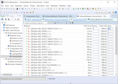
For advanced analysis, the ABAP traces can be converted to the SAP JVM Profiler format(*.prf) via the export button and then analyzed via SAP JVM Profiler.
The detailed information and analysis steps could be found in the following documents.
◉ KBA 2891307 – How to convert ABAP trace by profile data analyzer and analyze it with SAP JVM Profiler
◉ https://wiki.scn.sap.com/wiki/display/ASJAVA/Java+Profiling
Here we only list some screenshots to show the general idea about analyzing the converted ABAP trace in SAP JVM Profiler.


No comments:
Post a Comment