Analytical List Page is by far the most undervaluated and misunderstood S/4HANA Fiori Elements template. Here are the reasons why:
1. Overloaded with useless features (visual filter, KPIs, etc)
2. Used for wrong purposes (is it dashboard, list or both?)
3. Lack of user training (use of different charts, analytical path, lasso selection, etc)
In my blog I will explain how to make the most out of Analytical List Page Fiori apps for purpose of self-service visualization and data discovery.
Analytical List Page is very interactive. If you expect all visualizations and KPI nicely layered in front of you then you are in the wrong place. In this case you need IT authored S/4HANA Fiori Elements Analytical applications. Analytical List Page is neither list, nor dashboard. It is self service data visualization and discovery tool.
Analytical List Page has filter (compact or visual), table and/or chart and global KPIs. I recommend to use compact filter instead of visual filter. Visual filter is not fully functional and display only limited number of data points. I recommend not to use visual filter at all. There is also a problem with with global KPIs – they are not impacted by filter. You would rather not use global KPIs at all. Table and chart can be displayed one at a time or together. My recommendation to start with a chart, slice and dice data and switch to table only if you need to see document level details or drill down to document app. Table might display thousands and thousands of records and no way user can comprehend this data and derive valuable insights. There is an exceptions though and I explain it later.
I will show Analytical List Page in action using CMIR business scenario. CMIR app helps to measure impact of missing customer info record information on sales order creation. Here are KPIs that are used to measure the impact:
◉ Sales Order Amount
◉ Sales Order Days Late
◉ Purchase Order Days Late
◉ Sales Document Count
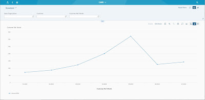
By default CMIR app displays compact filter and chart.
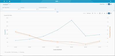
Sales Document Amount trend by month is displayed. Two more measures can be added to the picture – Sales Order Days Late and Purchase Order Days Late
Second axis is added because data is not scaled properly – Sales Document Amount in millions whereas Sales Document Days Late and Purchase Order Days Late in hundreds. Sales Document Count is in thousands that is why it is hard to analyze all four measure at once. But Sales Document Days Late and Purchase Order Days Late can be replaced with Sales Document Count
As you can see there is a spike in Sales Document Amount in 05.2019. You can select 05.2019 data point and swap drill down to Sales Organization to visualize contributing Sales Organizations.
For the ease of analysis data can be sorted by Sales Document Amount descending. SO05 and SO08 are two most contributing Sales Organization. You can understand SO05 Sales Organization data better selecting the Sales Organization and changing drill down by Customer
You can go back along the navigation path to analyze data for different Month or Sales Organization clicking on navigation path step hyperlink
One more powerful Analytical List Page feature is lasso selection. It allows visually select a subset of data before changing drill down to get more information. For example to see the most contributing Customers for two most biggest Sales Organizations.
You can inspect data on most granular level using switching to table and drill down for more document level detail navigating to Sales Document or Customer Material Info Record apps.
Table can also be used to analyze data grouping, sorting and showing totals and subtotals.
All you need to know about Analytical List Page is how to manipulate chart and table – Settings toolbar button.
In Setting you can define chart type (for chart), fields, sorting and grouping for both table and chart
P.S. Since S/4HANA release 2020 Analytical List Page apps can be created by users themselves


No comments:
Post a Comment