Almost every corporation has its own design guide& style for all its paperwork including envelopes, business cards, and various business forms, etc. As a developer, I am just concerned with the logic to populate the fields as long as have a detailed layout reference; and there is no need to consider layout design like layout structure, font selection, windows alignment, etc.
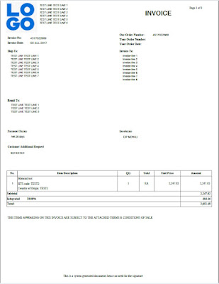
Until recently I completed one brand-new form development without existing similar reference, users complain that no error for the final output but it looks not very formal enough~
The user doesn’t give any detailed improvement opinions. After spending a few hours reviewing the whole layout design and comparing it with another form users think it’s more formal, I do find some tips that may make the output more formal, at least from my point of view, hopefully for the user as well
After all, I’m not a design expert and everyone has their own taste, so just FYI.
1. Use contrast fonts instead of the same Font
Better not use the same font for the title and its nearby elements like subtitles.
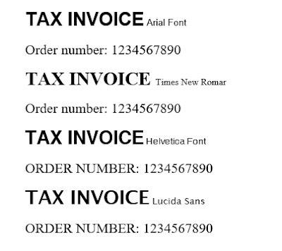
The font I used for the form title, sub title& address line is ‘Arial’, which looks a little plain (seem feeling for Times New Romar) compared with Sans serif font like ‘Helvetica’ mixed with Times New Romar. Besides, the capital letter is more official-looking than CamelCase.
After testing, I prefer using Helvetica bold with size 18 for the title while Times New Romar bold with size 8 for the subtitle in A4 paper. Helvetica italic with size 8 for all address lines and Times with size 8 will be the major font for the rest of the windows.
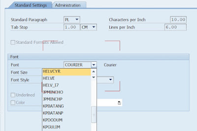
Btw, Helvetica font is one of the most used and remarkable sans serif typefaces in the designing market. It’s not free for commercial use but SAP embeds this font for script and smart forms used. That’s why fonts are chosen not from your local fonts but from system built-in drop-lists when designing script forms & smart forms.
Q1: Why Helvetica font is not available in adobe form?
A1: Unfortunately, when designing adobe form with the Adobe life-cycle designer, it will use local fonts from your PC/Laptop(like MS Office) instead of the SAP built-in font family. So if the Helvetica font is not available locally, you can’t use it cause no such font can be selected at all. Can replaced with other fonts which are locally available like Lucida Sans etc.
Q2: If you buy or download special font like Helvetica and then install it locally, what’ll happen to the PDF output using it?
A2: The generated PDF will display this font correctly only locally! If another user prints this PDF without this font installed locally, this special font will be replaced by another available font for sure!
Q3: How to set font replacement for adobe forms?
A3: We can control this font replacement by menu->Tools->Options at Adobe life-cycle designer, then click ‘Modify Font Substitutions’ and change accordingly.
2. Line space matters
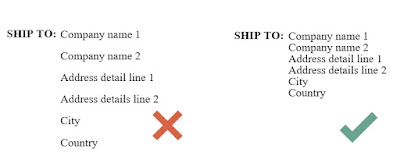
Too large line space between continuation lines like address lines will make the output looks very loose which will be regarded as un-formal~
There exist a default margin for each line and we can set it to ZERO for the bottom margin.
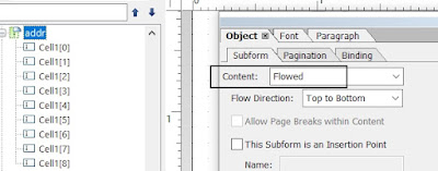
To make life easier, wrap up all address lines into one subform and set them as ‘Flowed’ which will save adjustment time after each height&margin setting.
3. Align every single window properly and cross windows if possible
As the order-related fields vary in length, aligning left is less clear than aligning Center. After we already have the invisible vertical line for center alignment, just repeat this alignment for the below part (here is the address for the invoice). Repeat the same pattern as much as you can.
4. Background filling&border lines
For the main item display, a light grey background for the item header will make the output look different.
Still, there’s a lot of room for improvement but definitely looks better than before I comfort myself. Below is the Purchase order template from IOM. Every sub-window has its border lines which make it very straight.
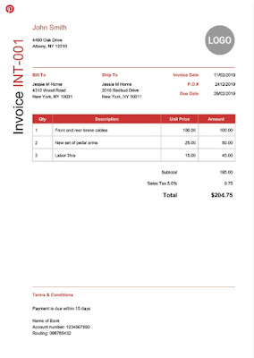
One Invoice layout example from Invoicehome.com. Just by using different font, alignment plus background color, the output will be looking quite different and its formal~





No comments:
Post a Comment