In this blog I am going to show you Adapt Ui feature for S/4Hana cloud, Private-Cloud and how outbound delivery classical application screen will be turn into simple informative one.
Let’s start..
With respective to Screen Personas, SAP S/4HANA and SAP S/4HANA Cloud are different solutions to address different customer needs, in the context of the user experience and adapting the UI they’re almost identical.
SAP Screen Personas, which is the technology that powers the Adapt UI capabilities for classic applications in S/4HANA Cloud. There are thousands of applications you can use to run your business. some of these apps are based on SAPUI5. These are often called Fiori apps. SAP Fiori is the standard UX for S/4HANA.
But Classic applications tend to be more complex, as they’re based on business processes. That means application must have functionality to accommodate potentially many business roles. As a result, most users will encounter items on the screen that are not relevant to them. So, I will explain how to adapt the user interface of classic applications in S/4HANA Cloud to improve usability and make them more modern and intuitive.
The capabilities that have introduced into SAP S/4HANA Cloud 2202 allow you to simplify these screens. Flavor editor in Private Cloud and SAP S/4Hana Cloud almost same but vast features are available in cloud that can’t be seen on Private Cloud.
Many specialists work together for satisfying the customers and strengthening the customer relationship. For example, on the order management, we have the internal sales rep, the shipping specialist around the delivery processing, and the billing clerk deals with the payment, to only name a few. Each of the roles is supported by a dedicated set of apps to accomplish the tasks.
The SAPUI5-based apps for the task focus on the needs of the typical business users already. However, some apps are classic applications that were built around a business object, like the outbound delivery. They cover all the aspects of the different business roles that might something from the business object.
With Adapt UI for classic applications with Screen Personas, you can create a variant of the screen that is tailored to the need of a specific business role.
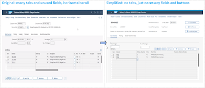
In our case, we want to do that for the shipping specialist working with an outbound delivery. If you compare the original screen (LHS) with simplified screen (RHS) below, you see how the target screen looks much simpler with much less information. And it’s here, it’s exactly what the shipping specialist needs.
We are hiding fields and information that are not required, providing quick access to the features that a business user need. We just made Shipping Specialist task easy 🙂
Picture1:
P1
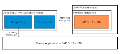
Flavors render a list of changes on top of the underlying classic apps.
Adapting the UI with Screen Personas creates a flavor with a change list on top of the original screen that is interpreted by the rendering engine at runtime. The original screen stays unchanged.
Picture2:
P2
Jump into Adapt Ui option in S/4Hana Cloud:
After successful logon to cloud S/4Hana, under user Avatar there will be “Adapt Ui” option will be available. Once we click on that we can see standard sap screen (Original Screen) and flavor editor part on top. We can edit, create, delete flavors, scripts and templates options can also be found.
Picture3:
P3
Picture4:
P4
With flavor editor we can simplify any complex classic apps (screen) by using its most effective features like
◉ Hide UI elements
◉ Rearrange UI elements
◉ Add custom fields or controls
◉ Define events for process automation through scripting
◉ Adjust styling
◉ Make suitable for table use
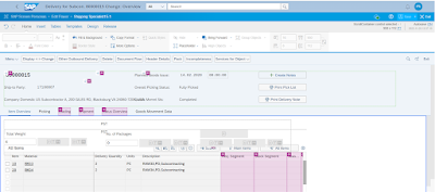
While using edit flavor editing, we can see pink icon, which are showing fields from standard screen that can be hide/delete with help of “Placeholder” control from “Home” tab. Here we have Delete control also, that means it’s not actual deleting only can hide.
Note: if you hit delete button, don’t worry 😊 No control will delete from standard screen.
Picture5:
P5
Picture6:
P6
If you see above screen Item Overview, Picking, Goods Movement Data tabs are collecting only necessary data in single container from different tabs & screens. Tab Merging concept is another feature we must talk about.
◉ Tab merging is when controls such as labels, input fields, tables or buttons are move out of their original tab
◉ The goal is to combine all necessary info for easier access and visibility
◉ Parking lot is a great feature that can provide you this makes work. It’s a separate pane where you can store controls from different tabs into a single container for temporarily use.
Picture7:
P7
Most of Flavor editor controls are same in both SAP S/4Hana Cloud and on-prem Screen Personas.
Picture8:
P8
In our example Shipping specialist uses a table horizontal scroll feature and uses maximum 6 columns out of 35. So, simplifying table feature enables you to avoid horizontal scroll and hide unnecessary columns that are not being used.
Picture9:
P9
SAP screen Personas includes its own JavaScript-based scripting engine. The scripting editor provides you below features:
◉ Include automation of various actions
◉ Add logic that is not part of original application
◉ Automatically generate scripts by recording manual interactions of a user
◉ Switch to the original screen while recording scripts, to ensure easy access to all controls and to work with the unmodified screen, avoiding the effect of flavor changes.
◉ Move the scripting area to the top or bottom of the screen or detach it to a separate window to give the object picker free access to controls on the screen.
Source: sap.com


No comments:
Post a Comment